Internal and Partner Reference
Brand Guidelines
Design system and brand reference for the Madelyn James Pediatric Cancer Foundation.
Brand Foundation
Core identity elements that define Madelyn James.
Mission
Increasing access & equity in pediatric cancer—by supporting low-income families in the ways that keep them stable, together, and able to pursue care.
The Promise
We show up—financially and personally—so families can stay together through the hardest season of their lives.
Brand Personality
Tender + fierce. (Maddy energy.)
• Warm (human, not corporate)
• Present (we don't disappear after a check is written)
• Credible (evidence-aware; grounded in real needs)
• Hopeful (joy exists here, without pretending it's easy)
• Modern (clear design, great typography, strong digital experience)
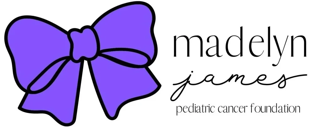
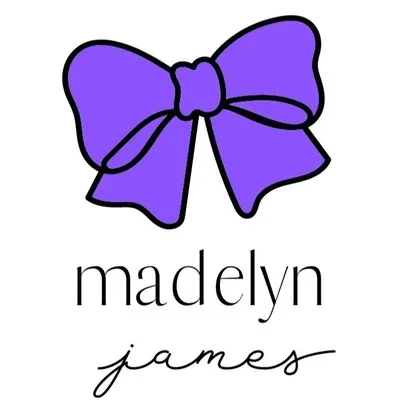
The Bow Symbol
From Maddy taking Hannah's bow, to Maddy choosing her bow each morning, the bow became a ritual of love and identity. It represents:
• A daily choice to show up
• Togetherness (family, community, care teams)
• A support net that holds
• Infinity — when you tie two ends together, it forms an endless loop: Maddy's legacy and lasting support
Design Implications
- Ribbon lines — looping, tying, connecting elements
- Soft, rounded shapes — care, gentleness
- Strong contrast moments — fierce advocacy for equity
Brand Modes
Mode A: Core
Website, programs, impact
- Warm White / Lavender backgrounds
- Controlled purple accents
- Confident, warm, credible tone
Mode B: Celebration
Events, milestones
- Bokeh, confetti allowed
- Higher saturation purples
- 1–2 decorative effects max
Mode C: Remembrance
Maddy moments, "Light a Candle"
- Deeper purples, quiet composition
- More whitespace
- Golden Light accent works well
Logo System
Official logo assets and usage guidelines.
Logo Downloads
Usage Guidelines
✓ Do
- Keep clear space equal to bow's center knot height
- Use on white, off-white, or light lavender
- Use reverse logo on dark backgrounds
- Min sizes: horizontal 200px, stacked 140px, icon 24px
✗ Don't
- Stretch, skew, or rotate
- Recolor the bow
- Add heavy drop shadows
- Place on busy photos without overlay
Color Palette
Click any hex code to copy.
Primary Colors
Background & Neutral Colors
Color Usage Ratio
Gradients
Hero Gradient
linear-gradient(180deg, #FFFCFF, #EFD7F9)CTA Gradient
linear-gradient(135deg, #7F30BC, #A966F4)Typography
Two fonts only: serif headlines + clean sans body.
Font Families
Headlines
Alice
Classic, warm serif. H1, H2, H3, pull quotes.
'Alice', Georgia, serifBody & UI
Inter
Clean, readable. Body, nav, forms, buttons.
'Inter', sans-serifType Scale
H1: Keep families together.
H2: We stabilize the family.
H3: Deep support is real support.
Body: We provide deep, personalized support to low-income families.
MICRO HEADLINE
Spacing Scale
Consistent spacing units.
--space-xs--space-sm--space-md--space-lg--space-xl--space-2xlComponents
Reusable UI elements.
Stats Display
Blockquote
"The support from Madelyn James helped us focus on what mattered most—our daughter's health."— Sarah's Mom
Photography
Standards for imagery.
Content
- Real families, real moments
- Dignity-first (strength, togetherness)
- Inclusive representation
- No "generic stock sadness"
Treatment
- Natural color, warm-neutral tones
- Avoid heavy purple overlays
- Keep faces clear and natural
- Focus on connection
Voice & Messaging
Warm, direct, dignity-first.
Writing Rules
• Short paragraphs (2–3 lines)
• Strong first sentence
• Specific proof points, not vague claims
• Dignity-first storytelling
Signature Lines
• Keep families together through pediatric cancer.
• We go deep, not wide.
• We don't assume what families need—we ask.
• Equity in pediatric cancer.
• Deep support. Meaningful connections.
• With families through whatever "after" brings.
Language Guide
✓ Use
"Keep families together" • "Deep support" • "Family-led" • "Low-income"
✗ Avoid
"Underprivileged" • "Victims" • "Hopeless" • Pity framing
Quick Reference
The 5 essential rules:
- Bow stays the hero symbol.
- Primary purple for action, not decoration.
- Use lots of white space.
- Two fonts only: Alice + Inter.
- Be warm and direct. Never dense. Never pity-driven.